Rooted in the principle of Design that Cares, we reimagined their identity and digital experience


Design Process
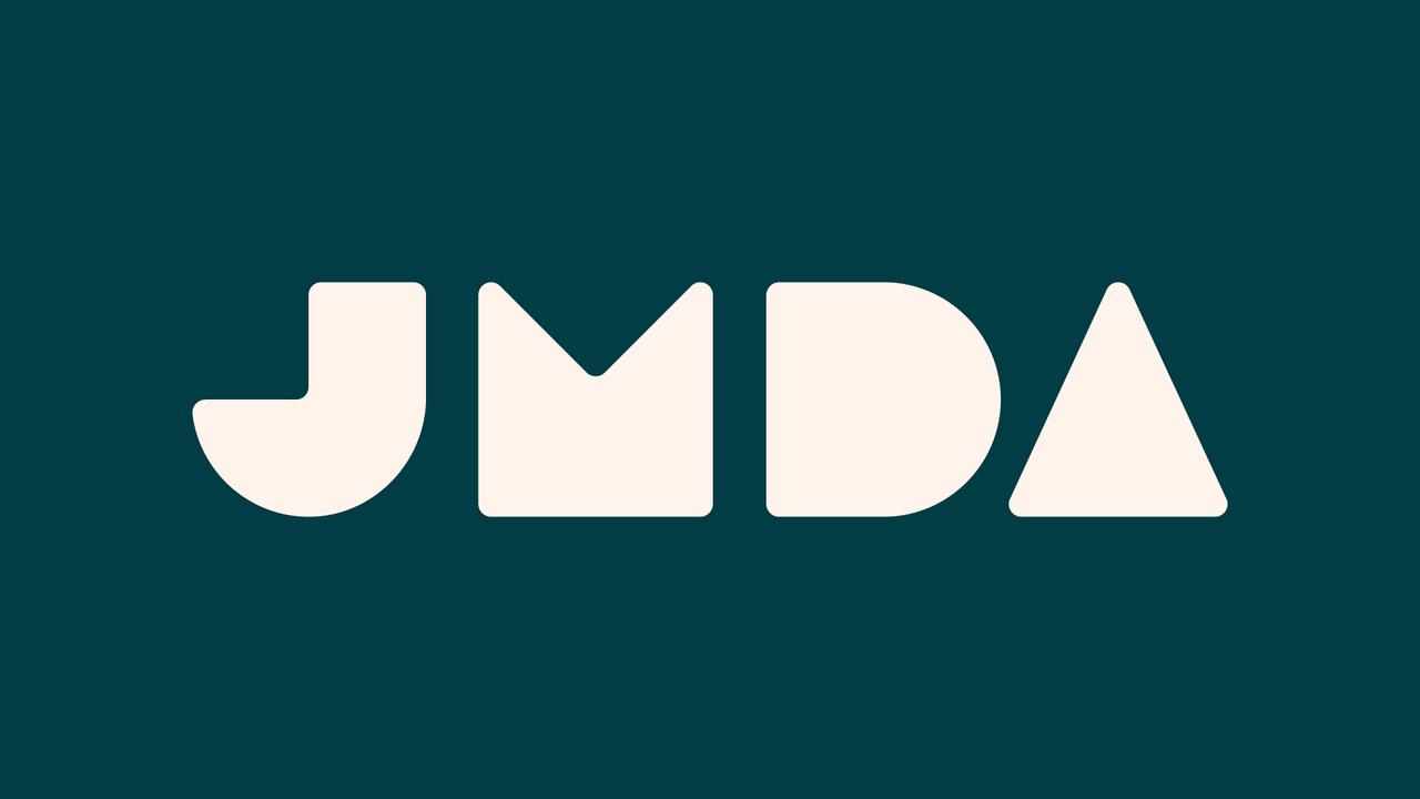
We reworked JMDA’s brand identity from the ground up, evolving their logo into a more confident, contemporary mark that captures the spirit of innovation at the heart of their work. The refreshed colour palette introduces bolder, more vibrant tones to reflect their global presence and energy, while a refined typographic system brings clarity and consistency across all touchpoints. Combined with updated visual assets and brand guidelines, the new identity positions JMDA with a distinctive, future-facing look that aligns with their Design that Cares ethos.


Final Result
The refreshed identity gives JMDA a brand that finally matches the quality and ambition of their work. It feels sharper, more assured and more distinctive in a competitive product design space, while still retaining the warmth behind their “Design that Cares” ethos. The stronger visual language carries confidently across digital, exhibitions and client presentations, helping them show up with greater authority and consistency. Ultimately, the rebrand positions JMDA as a forward-thinking design and engineering consultancy, ready to attract higher-value projects and a broader international audience.
4th Dimension Partners
Brand Identity/Website

Howgate Sable
Howgate Sable required a luxury brand identity to reflect their expertise as a leading executive search firm.

Perrigo Consultants
Perrigo Consultants needed a professional brand identity to reflect their expertise as trusted accountants.

Second Peak Performance
Fresh identity for business supporting Athletes transitioning from sport to business

Halesowen Gas Services
A confident rebrand and digital presence to reflect a growing, professional building services contractor.

Platform Events
A dynamic identity built around connection, movement and shared experience.

Therm Solution
A confident, modern identity for a specialist heating and thermal solutions provider.

Prescott & Joule
Prescott & Joule needed a brand identity that reflected their expertise in designing and creating beautiful, high-quality kitchens.

ZO&CO
A refined brand refresh to elevate the look and feel while keeping the warmth at the heart of the business.

Ascott's
Ascott’s needed a brand identity that reflected their vibrant atmosphere as a bar and street food restaurant.

Bradwall Bakehouse
Bradwall Bakehouse needed a rustic brand identity to reflect their artisan approach to baking.

Sinclair Taylor
A confident, professional identity and website for a specialist debt recovery firm.

Frames & More
A refined identity crafted around a simple idea, framing what matters.

Life leisure
Complete brand refresh for UK Leisure centre