A refined brand refresh to elevate the look and feel while keeping the warmth at the heart of the business.

Design Process
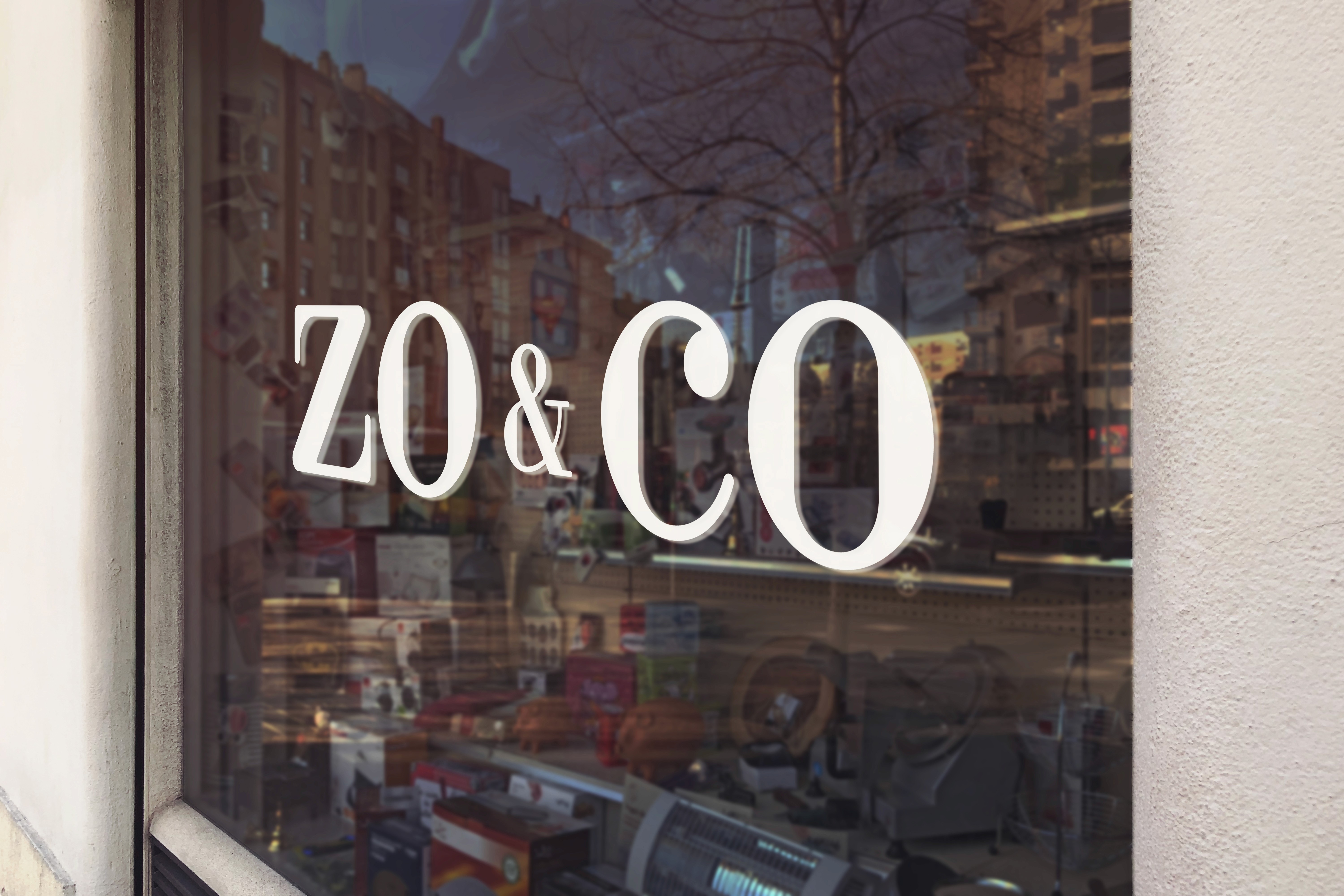
Zo & Co needed an identity that felt more premium without losing its friendly, personal charm. We began by refining the existing brand, simplifying and elevating the visual elements to create a more polished and cohesive look. Typography was carefully selected to feel elegant yet approachable, while the colour palette was softened and balanced to introduce a subtle sense of luxury.
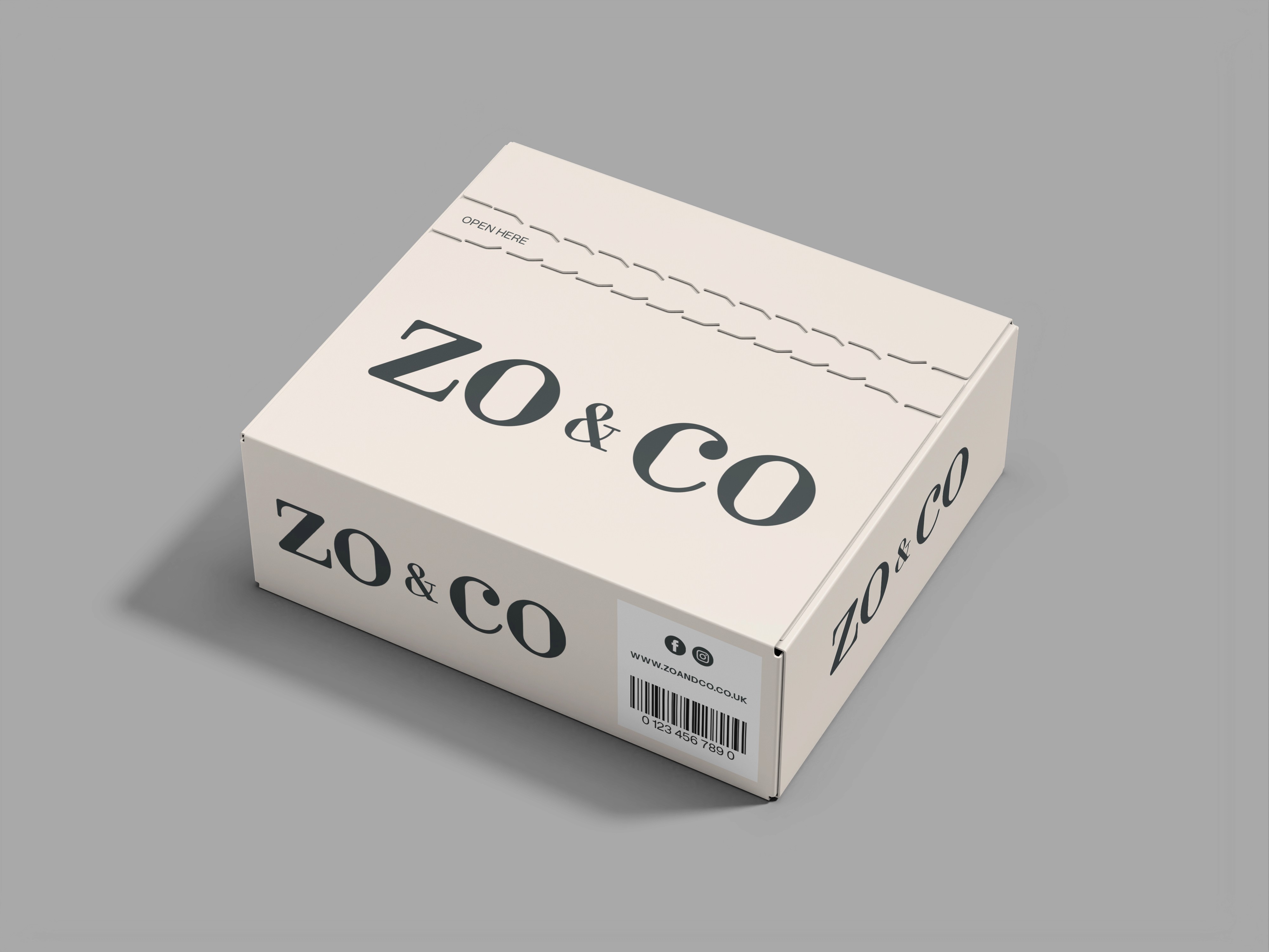
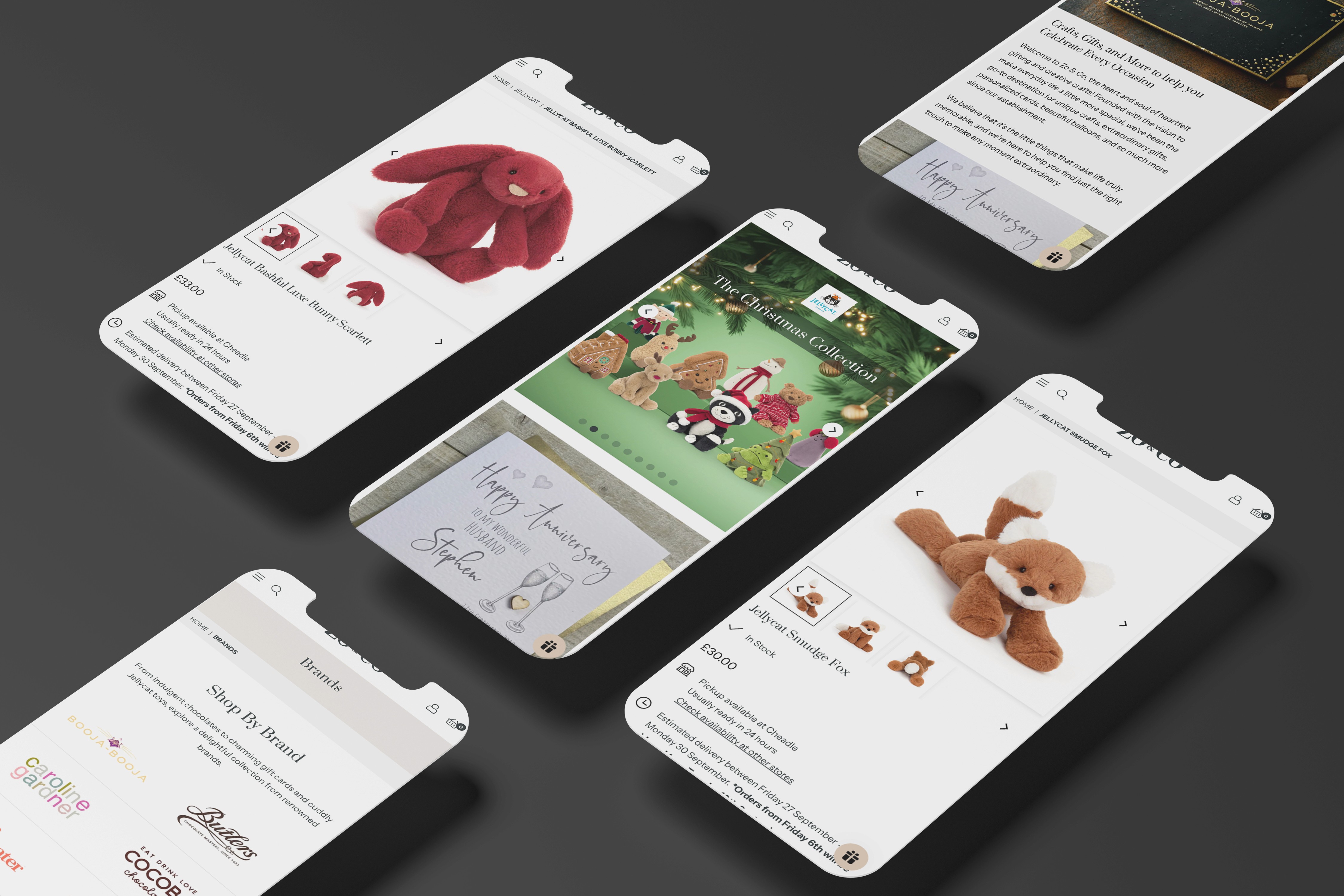
The updated visual system was designed to work seamlessly across packaging, social media and the online store, ensuring consistency at every touchpoint. We paid particular attention to how the brand would appear in digital environments, creating a clean and considered aesthetic that enhances product photography and supports a smooth shopping experience.
Final Result
The refreshed identity positions Zo & Co as a more established and premium gifting brand, while still feeling warm and accessible. The elevated visual language builds trust and enhances perceived product value, helping the business stand out in a competitive online market. Together, the updated branding and digital presence provide a stronger foundation for growth and customer loyalty.
4th Dimension Partners
Brand Identity/Website

Howgate Sable
Howgate Sable required a luxury brand identity to reflect their expertise as a leading executive search firm.
JMDA
Rooted in the principle of Design that Cares, we reimagined their identity and digital experience

Perrigo Consultants
Perrigo Consultants needed a professional brand identity to reflect their expertise as trusted accountants.

Second Peak Performance
Fresh identity for business supporting Athletes transitioning from sport to business

Halesowen Gas Services
A confident rebrand and digital presence to reflect a growing, professional building services contractor.

Platform Events
A dynamic identity built around connection, movement and shared experience.

Therm Solution
A confident, modern identity for a specialist heating and thermal solutions provider.

Prescott & Joule
Prescott & Joule needed a brand identity that reflected their expertise in designing and creating beautiful, high-quality kitchens.

Ascott's
Ascott’s needed a brand identity that reflected their vibrant atmosphere as a bar and street food restaurant.

Bradwall Bakehouse
Bradwall Bakehouse needed a rustic brand identity to reflect their artisan approach to baking.

Sinclair Taylor
A confident, professional identity and website for a specialist debt recovery firm.

Frames & More
A refined identity crafted around a simple idea, framing what matters.

Life leisure
Complete brand refresh for UK Leisure centre